One of my main attractions ot social network analysis is the way that it can represnt social structure in interesting and often aesthetically pleasing pictures. Here is a small annotated list of some of the networks that I've generated in my work. A few of these are published, but most are just to help me understand the data a little better.
Participant-Aided Sociograms
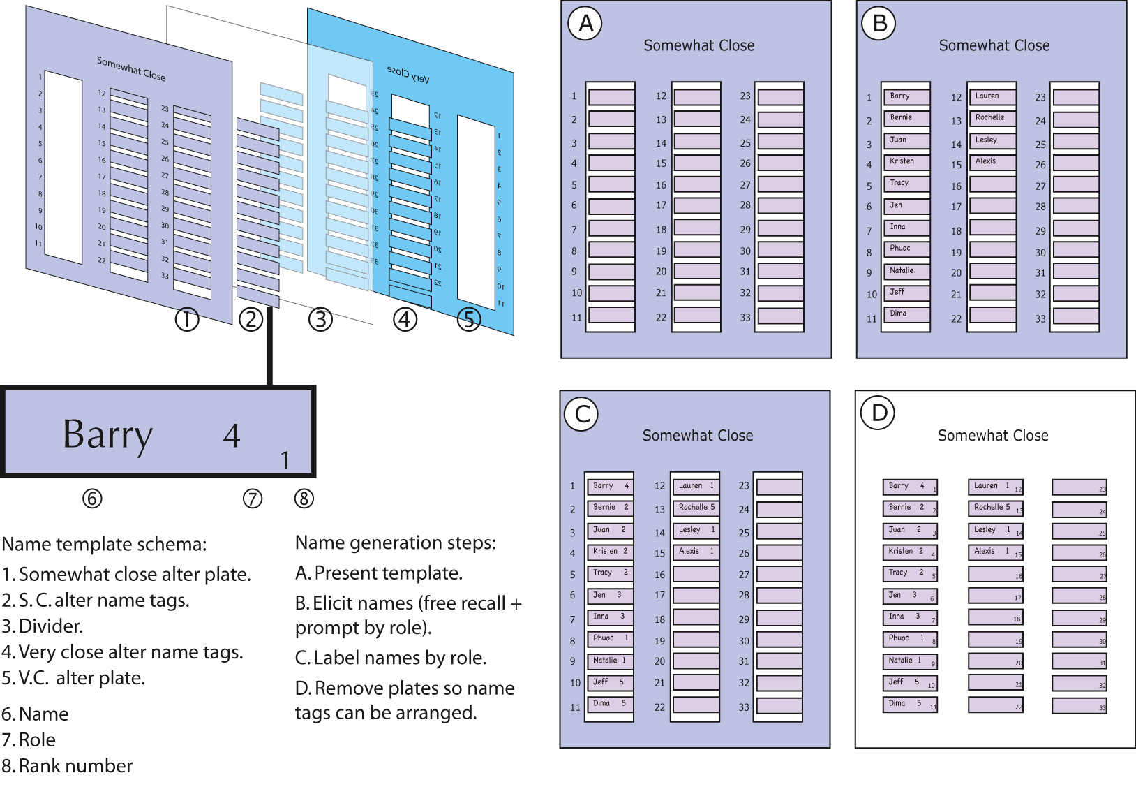
One of my first network analysis tasks was to assist Barry Wellman in developing a new name generator for the third East York study (commonly referred to as
Connected Lives). Below are a series of images detailing this project.
Name-template schema. This is a schematic (featured in Field Methods) detailing how we captured the names of respondents on little post-its. It made these myself out of cardboard and rubberized glue. It was fun (I felt like I was in grade 6 again).
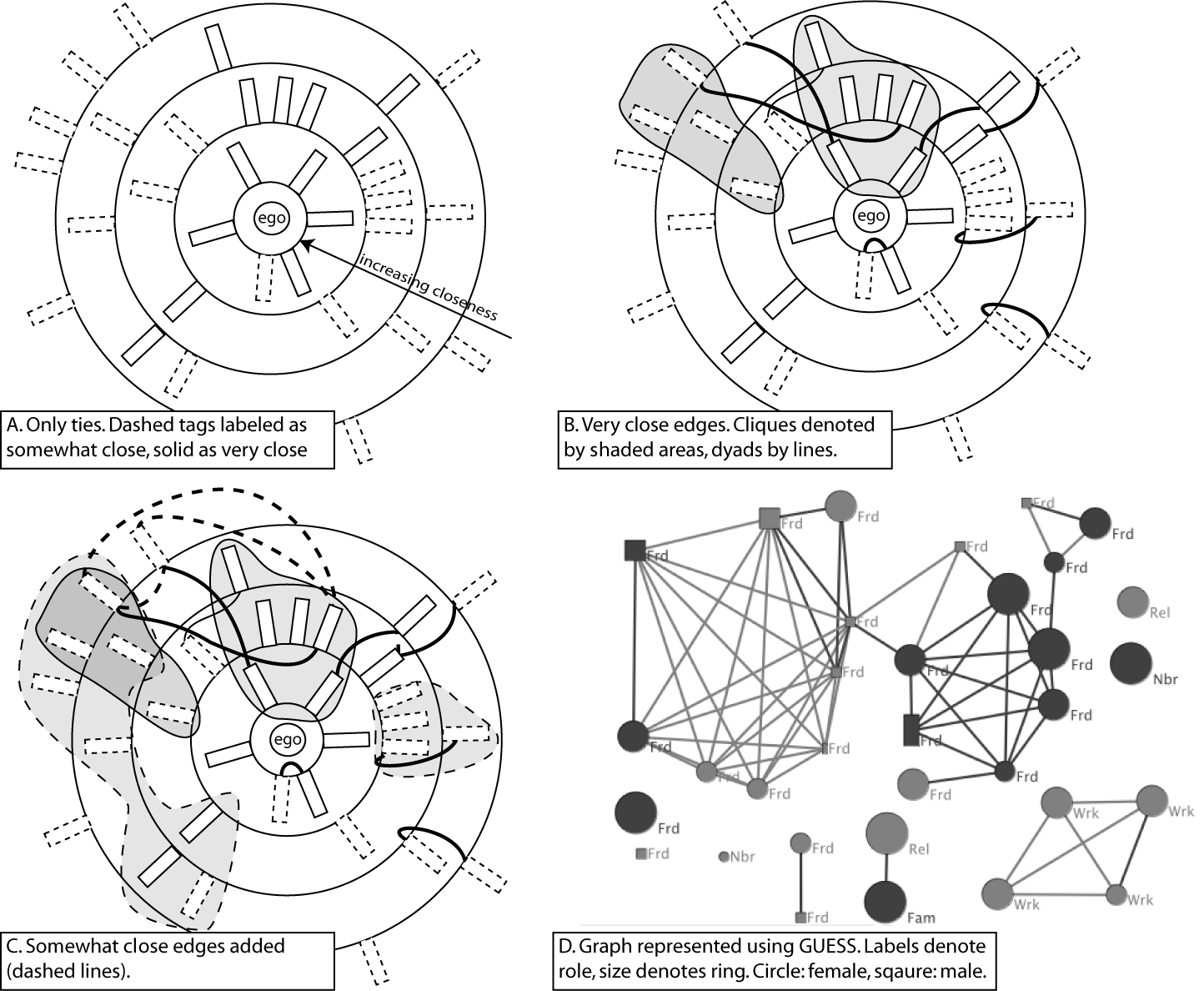
Network drawing sequence. This is a step-by-step diagram detailing how we laid out the networks on large sheets of paper and then drew lines to denote closeness.
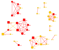
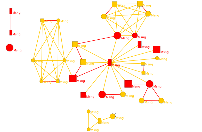
Resulting network (roles): This is an example resulting network. Node size represents closeness to alter. Labels refer to roles (i.e. the way the respondent knows alter). Circles are women, squares are men. Notice this person has a number of separate groups representing different spheres of their life. By contrast this network shows a respondent who has one big network who mainly know each other.
Resulting network (frequency of communication): Here is a second pass at these networks where I explored potential relationships between frequency of communication and social support. Frequency of communication is represented by the height of the nodes, and social support types are in the labels.
SNARF at Microsoft Research
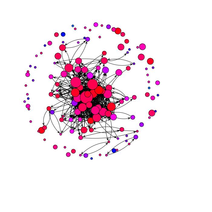
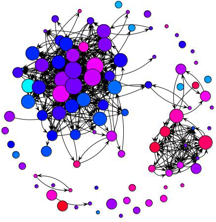
In the summer of 2005, I worked under Danyel Fisher as an intern at Marc Smith's Community Technologies Lab at Microsoft Research. I was analyzing email behaviour patterns using a novel tool called SNARF. If you're running XP / Vista and Outlook, I highly recommend checking it out. Here are some email inboxes rendered as sociograms. The colours represent the balance of communication between ego and alter (all red means the other person does all the communicating, all blue means the respondent does all the communicating). The size of the node is scaled to represent number of messages between the respondent and that person.
Balanced Network: notice the distribution of blue and red. That indicates some ties send more, some send less, but overall this person tries to keep up.
Ego-dominant network: Notice its primarily blue. That's indicating that with virtually everyone, this person sends more than they receive.
Alter-dominant network: This person is the dreaded black-hole of internet communication. Messages get sent, and sometimes replied, but not very frequently.
Novel network (Sub-groups): This is an interesting case of someone who has a subgroup that mainly receives messages from alter, and another group that mainly sends messages to alter.
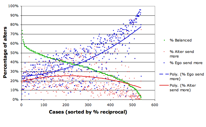
Plot of all networks: This is an overly complicated plot highlighting the proportion of ties that are reciprocal, mainly senders and mainly receivers. There are three dots for each person. A blue one representing percentage of mainly-receiving ties, red one representing mainly-sending ties and a green one representing reciprocal ties. Moving from left to right you see the proportion of reciprocal ties decreases, the proportion of mainly-receiving ties increases. That is to say, when people aren't broadly reciprocal, its not because they are usually black holes or lazy, its because they are usually sending more than others can keep up with.
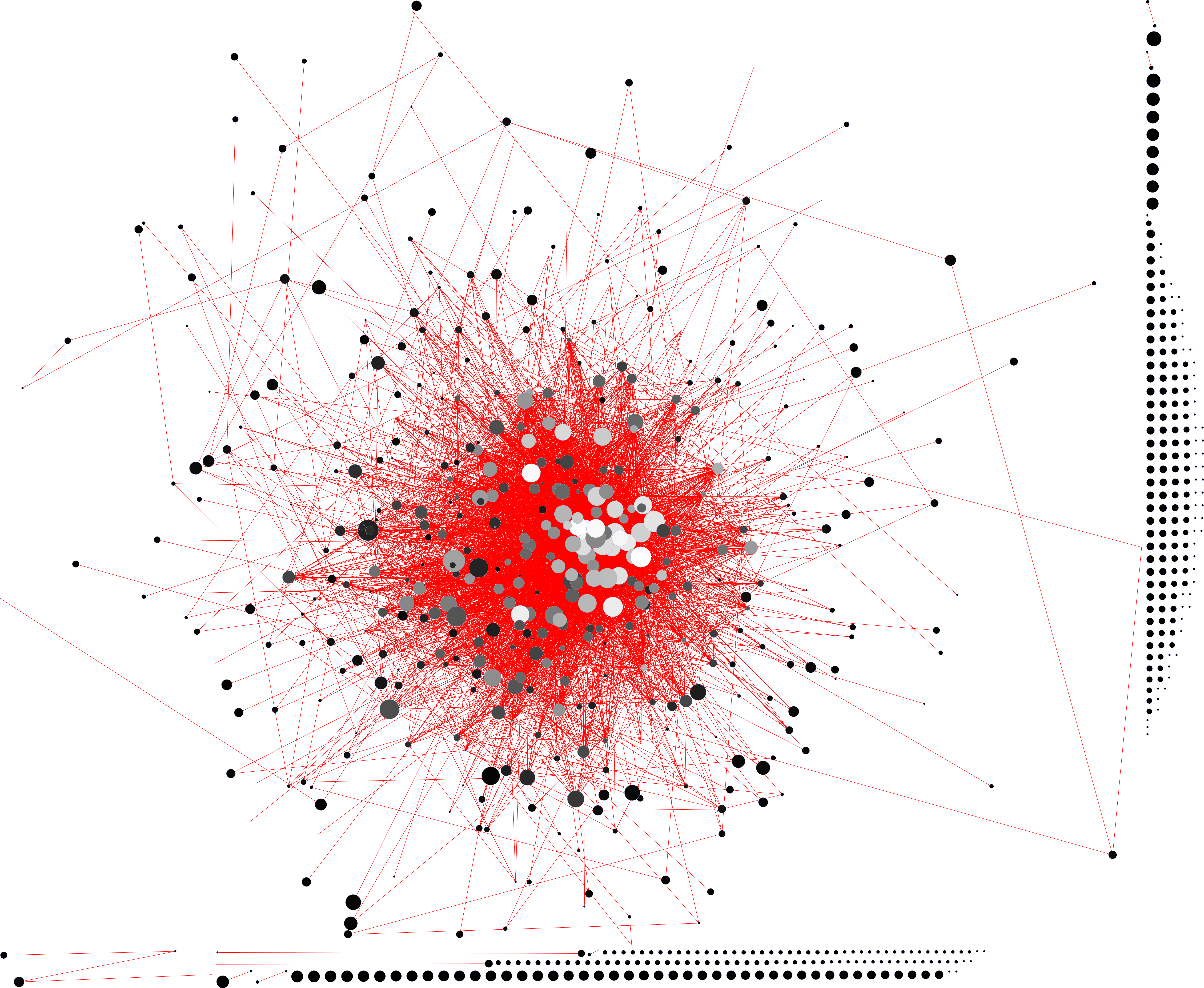
Agenda Setting in Digg.com
Two years ago, I was approached to write a chapter on how to research social networks online. As I was very interested in Digg.com, I decided to examine the structure of the major players on Digg. What's interesting is how neatly they cluster into one big ball. I've done some regression analyses on this as well. The short version: it helps to have fans in high places. Also, the number of friends / fans / watched strongly predicts the number of popular stories among top diggers.
The Digg network from the top. To scrape Digg.com, I chose to examine the top 910 diggers as of February 27, 2007. These diggers mainly split to two groups. Those who were a part of a giant component of friends and those who weren't. This is a view of the giant component from the view of digitalgopher. At the time, digitalgopher was Digg's number 1 submitter with over 2000 stories submitted and a success rate of approximately 48%. This meant that half the time, digitalgopher's stories made the front page. As you can see, he is well tied to many of the other top posters. That means that every time he submits something, it will show up on the new stories list of many individuals.
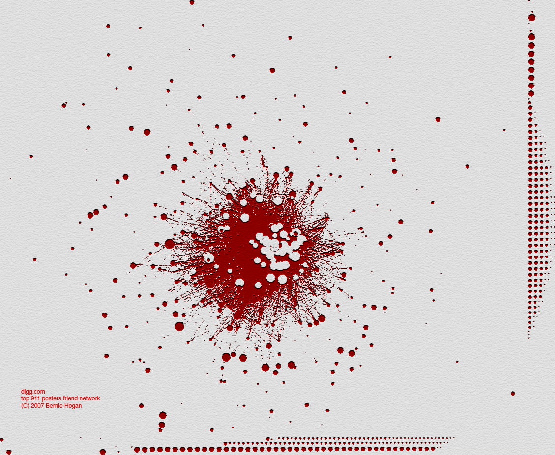
Top 7 whole network: This is a social network of all the mutual ties between digg users who have had at least 7 stories make it to the front page. Notice that there is not series of subgroups, but one large component and a whole lot of lucky isolates. (Note - many of these isolates actually have really large networks, they just aren't networks of people in the 'top 7'). And if that wasn't geeky enough, here's the same network filtered through photoshop for fun, looking like a blood splatter, or some such thing. A MASSIVE version is located here.
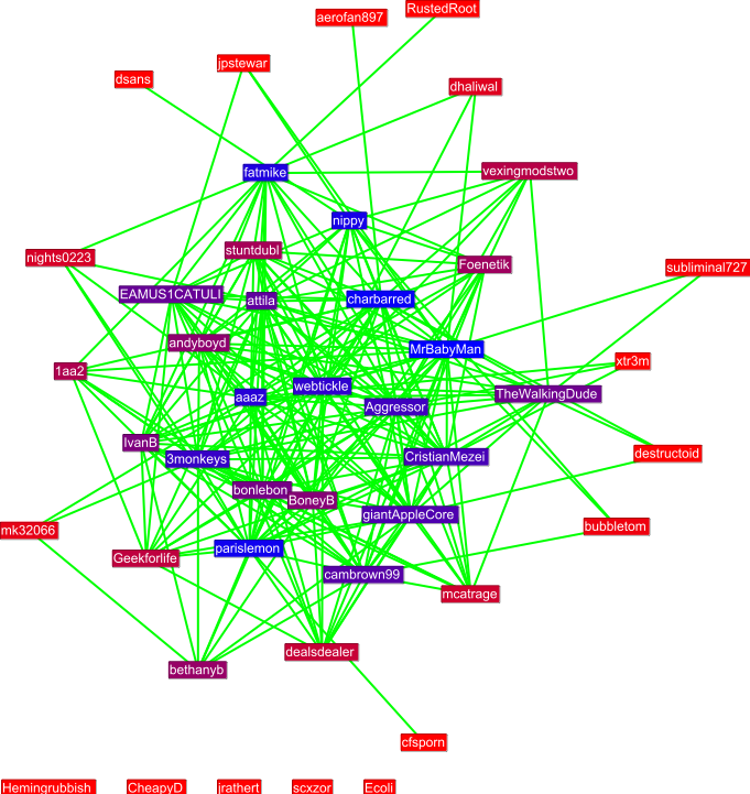
Example egonet: This is the personal (ego) network for GrilledOnion as of the end of January 2007. You can find your own personal network using this script written in python. It spits out a network as a .gdf file, which means you can open it up in GUESS.