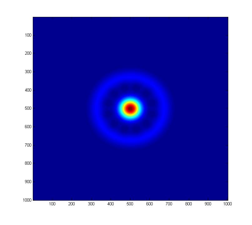
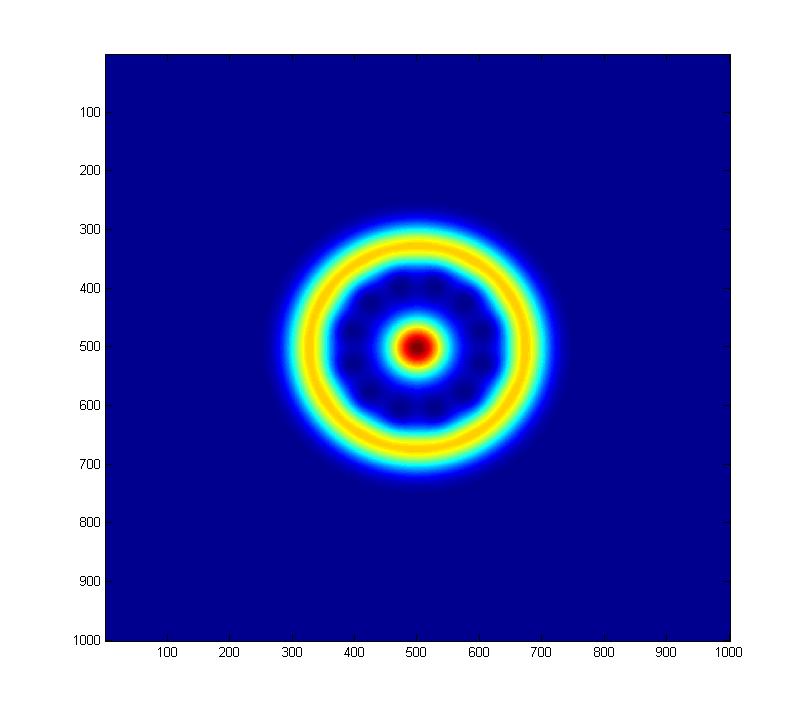
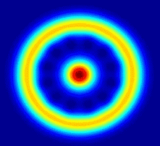
Part (i)
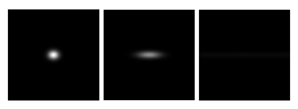
Theta=0, Phi=0 (Note: Axis labels are in pixels, *not* the coord system used to generate plots.)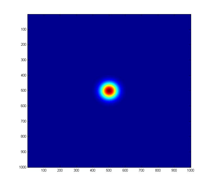
Theta=pi/2, Phi=0
Theta=3pi/4, Phi=0
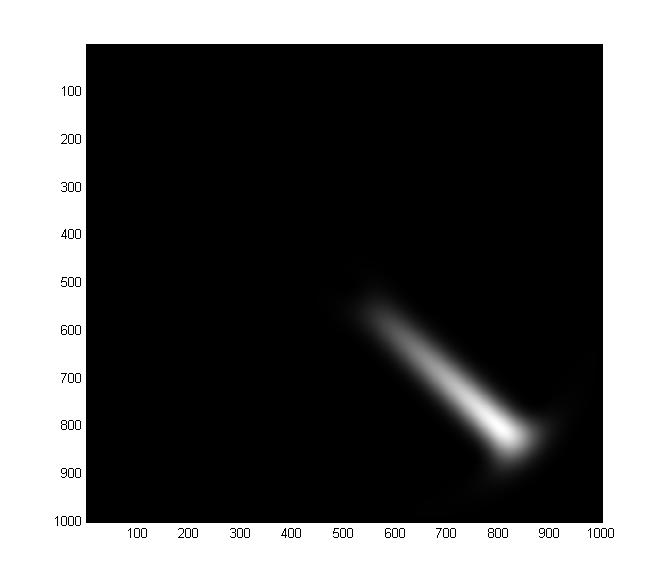
Theta=3pi/4, Phi=always increasing in increments of pi/4
Part (ii)
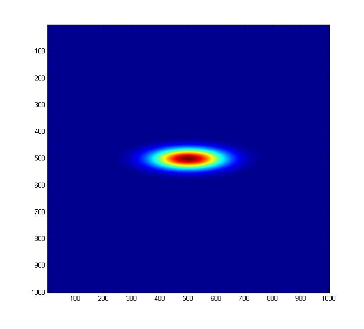
Linear plot of superposition of |B=3> and |B=-3> coherent states (now in black and white for some reason)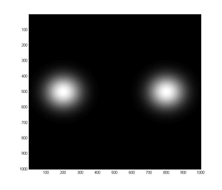
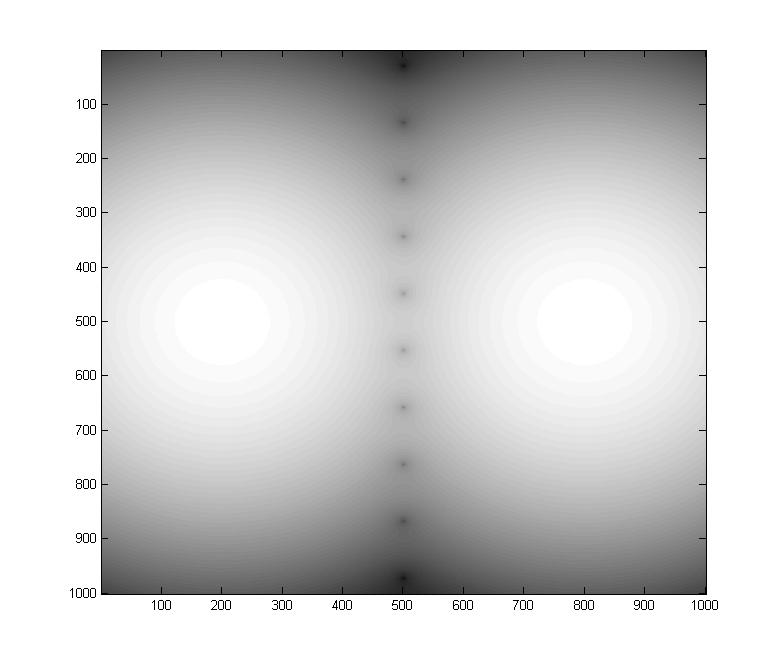
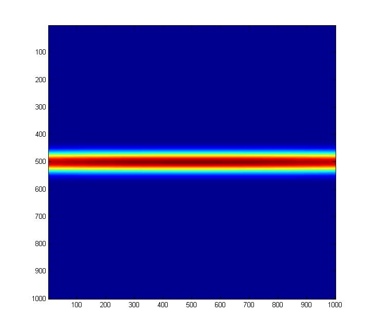
Logplot of superposition of |B=3> and |B=-3> coherent states
Part (iii)
Sum of first 10 Fock states with phi=pi/4...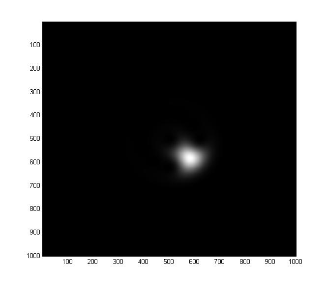
50 Fock states
100 Fock states
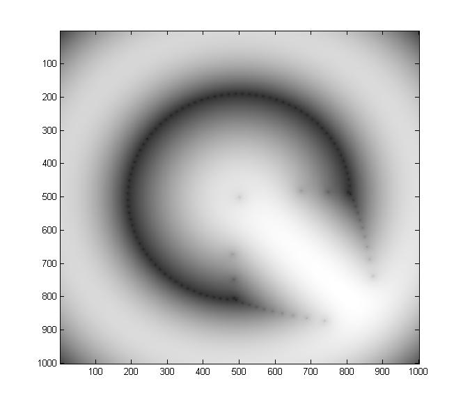
100 Fock states on a log scale (you can see weird interference patterns here)...
Part (iv)
Squeezing the vacuum with epsilon=0.2 ...
epsilon=1.2
epsilon=4. Note that the color in these color images is scaled to the maximum value of
of the Q distribution in the image, hence "red" in one image does not correspond to the same Q
distribution value as "red" in another image.
Here are the three images again (epsilon=0.2, 1.2, 4), but this time they're properly scaled
relative to one another. It really does seem that the "squeeze" operator seems to
stretch and rarefy the state rather than squeeze it (though I may have screwed something up).
Part (v)
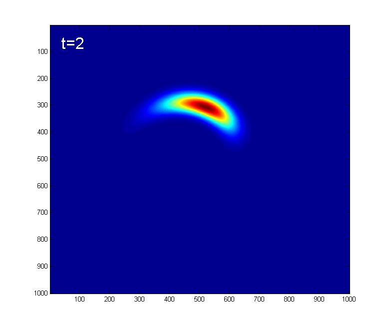
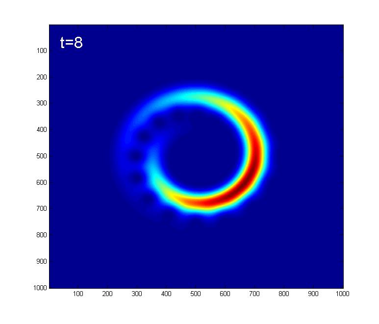
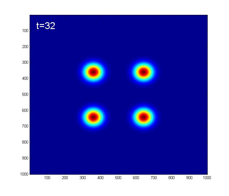
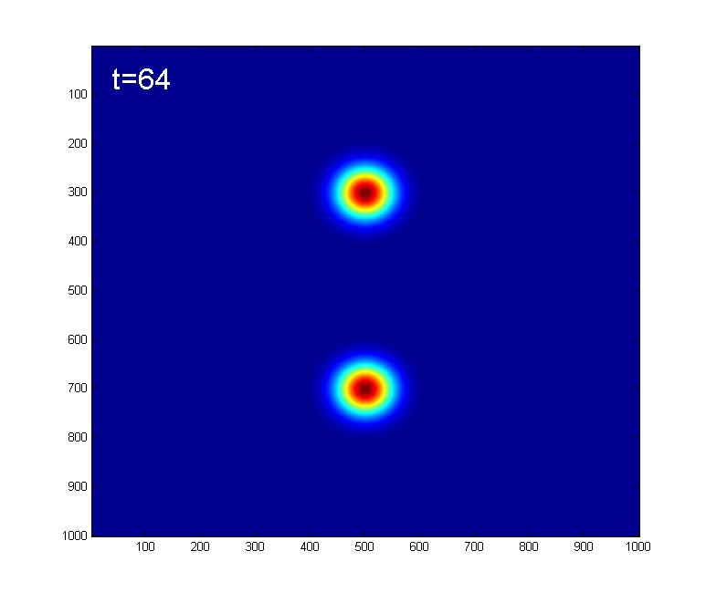
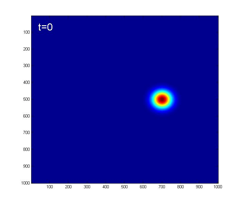
Here we look at the effect of the Kerr nonlinearity on an initial |A=4> coherent state.Below are some snapshots showing the time evolution due to the Kerr Hamiltonian:

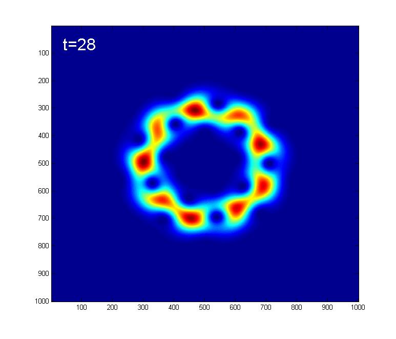
At t=32, 96, we get what looks like 4 coherent states
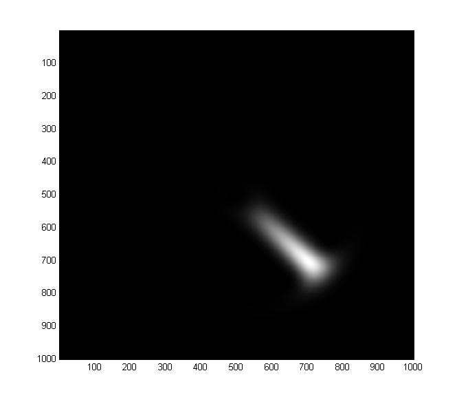
At t=64 we get 2 coherent states
At t=128, the state would return back to the original coherent state, |A=4>.
A ~2mb gif of one period of Kerr time evolution is shown here.
Poorly commented MATLAB code which generated all of these pictures is available here.