|
2.0 Arrival
2.1 Parking
For employees with physical disabilities, parking at the RBCI building may not leave the best first impression. The entrance parking lot has 3 dedicated wheelchair parking spaces. As illustrated in appendix A, there is an efficient amount of room within the designated parking spot for a person in a wheelchair to move. The main issue is that the distance from the designated parking spots to the entrance door could be improved. Appendix B illustrates the amount of space a person would have to travel from the designated parking spot to the entrance door. There are four rows of parking spaces in the parking lot. The row that has the 3 dedicated wheelchair parking spaces is the farthest from the building. This violates principle 1 of the universal design principles. Equitable use is violated in this case because employees with disabilities are at a disadvantage if they are farthest from the building. Within the functional diversity characteristics, mobility can also be improved upon. In order to perform this common task, a person with a physical disability would have to travel farther in order to reach the entrance building. A basic solution would be to modify the parking lot such that the wheelchair accessible parking spaces are in the middle two rows of the parking lot. This makes the traveling distance between the parking space and the entrance door as minimal as possible. Appendix B also illustrates that there is a small amount automobile traffic that has to be passed in order to get from the parking space to the entrance door. Thus, making a wheelchair accessible spot as close to the building as possible is safer for those who have physical disabilities.
|
Appendix A
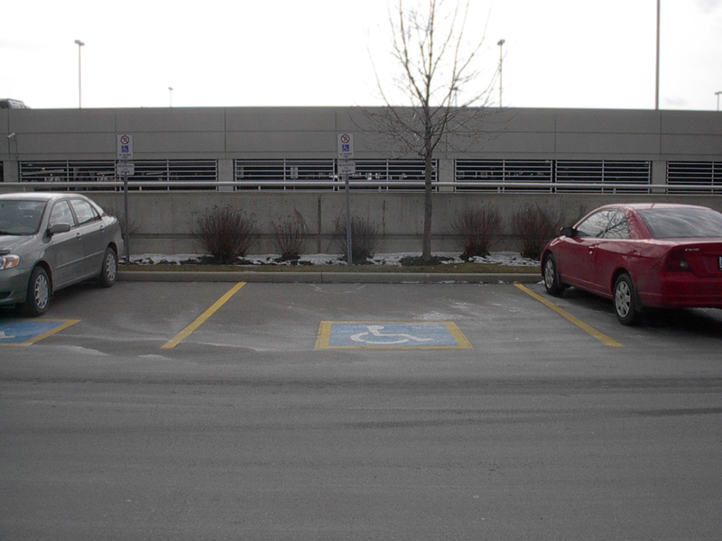
Image taken by Ryan Rattos
Appendix B
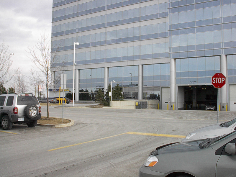 Image taken by Ryan Rattos
|
2.2 Entrance
Upon entrance into the building, Appendix C reveals that there is a curb cut. This curb cut is wide enough to fit two wheelchairs. This particular factor is efficient because if two employees in wheelchairs needed to utilize the curb cut at the same time, they wouldn't have to wait for one another (Danford, 2004). Appendix C also illustrates that there is a small lip' in between the road and the curb. Michelle Liberti Lansing points out that it is important that transitions between various floorings in an area should have smooth transitions for better mobility (Liberti-Lansing, 2006). She notes that these lips can provide a difficult time for those trying to get by using a wheelchair (Liberti-Lansing, 2006). It is important to also note that |
Appendix C

Image taken by Ryan Rattos
|
any wheeled device may experience difficulty over these lips as well. Wheeled-buggies and carts are examples. Thus, as Liberti-Lansing points out, a smoother transition between these surfaces would be beneficial to any universal user, which corresponds to equitable use principle of the universal design principles. Another issue regarding the entrance is the timer on the wheelchair accessible door. Using a stopwatch, time was kept from the minute the wheelchair accessible door was fully open until the moment it began to close. This was approximately 2 seconds. This is insufficient because it makes employees in wheelchairs feel as if they have to rush. Given that the wheelchair can comfortably fit through the door when it is fully open, this proves that the time allocated is insufficient. Jane Boyd Ohlin states that public doors should operate on slower timers so that employees may enter elevators without feeling like they have to rush (Ohlin, 1993) . Although this door is designed especially for people in wheelchairs, it does not efficiently do what it is set out to. Not allowing enough time to pass through the door ruins the entire design because it is not efficiently usable. To agree with Ohlin's idea, it would make most sense to slow down the door timer so that it is more accessible for use. |
2.3 Hallways Once entered in to the building, Appendix D illustrates the hallway that must be walked through in order to get to any employee's workspace. As illustrated, there is a very low contrast, which makes it difficult for the visually-impaired to distinguish anything (Novitski, 2001). Brightness plays an important role in this issue. Brighter lighting would aid this issue as well as make it easier for an employee with visual impairment to travel through. In addition, the caution' pylon is not placed in a sensible area. An employee in a wheelchair may find it uncomfortable to wheel around the pylon. Also, an employee with low vision or vision impairment will not expect that an object would be placed in the middle of any hallway. Although the pylon is highly contrasting to the rest of the hallway, it can still be problematic where these groups of employees are concerned. The obvious solution would be to move the pylon off to the side. This way, everyone will still see it because of its high contrast. Also, it will be far less problematic for employees in wheelchairs or with vision-impairment.
Appendix E illustrates the same hallway in Appendix D, but from the inside. Once the doors have been entered the brightness increases. This is more sufficient for those who are visually impaired. There is a higher contrast, which allows for easier vision. There is a 90-degree |
Appendix D
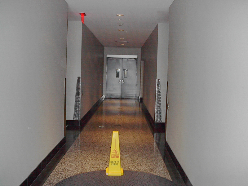
Image taken by Ryan Rattos
Appendix E

Image taken by Ryan Rattos
|
turn towards the elevator foyer. Marie Laporte-Spark notes that hallways should have straight isles with 90-degree turns to enable easier mobility for the blind and visually-impaired (Laporte-Spark, 2000). The patterns on the floor are good visual cues to let employees with partial vision know that they can turn. The black pattern that extends outwards is a great indication of this. One thing that can be improved upon within the hallway is the utilization of Braille and tactile maps. These maps may be placed at the entrance and used so that critical information, such as room locations, can be located (Novitski, 2001). This would allow for better design according to the equitable use principle. Additionally, it would allow better mobility for a larger range of people. Thus, the functional diversity characteristic of mobility is met at a more efficient level because a greater range of people can be directed. |
2.4 Elevators
Upon entering an elevator to reach higher floors, a person in a wheelchair may experience the same discomfort that they experienced at the entrance door. The timer on the elevator doors only allows 2 seconds from the time it is fully opened until the time it begins to close. This was timed using a stopwatch and was recorded. As stated earlier, slowing down the timer would be beneficial so that employees in wheelchairs don't feel as if they have to rush.
Once the elevator reaches the main floor and the doors are about to open, it makes a beeping sound along with a flashing light. These are vital design features that benefit the vision impaired as well as the hearing impaired.
|
Appendix F

Image taken by Ryan Rattos |
The buttons both in the hallway and in the elevator are located at a low level. This benefits employees who are in wheelchairs and employees with low motor skills and arm function. At the same time, it doesn't take away usability from employees who aren't in wheelchairs or who don't have low motor skills.
Appendix F illustrates the interface that employees must interact with when using the elevator. The buttons on the elevator interface are tactile. In addition there is Braille located directly underneath each number. The only major thing that could be improved is the contrast levels of the buttons to the rest of the elevator. Appendix F illustrates that the buttons as well as the rest of the elevator material is the same metal color. This subtracts from the strength of the design in the elevator. It provides many design features that allow for a range of abilities to use it. However, once inside, a person who has low vision may find it difficult to locate where the buttons are on the elevator. A basic remedy would be to change the color of the buttons so that there is more of a contrast when compared to the rest of the elevator. |
3.0 Workspace>> |
|