Appendix I
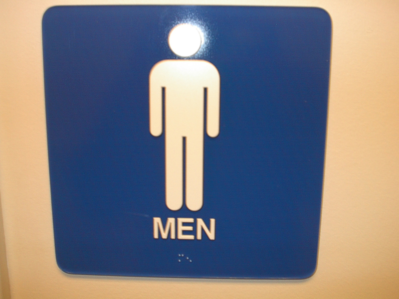
Image taken by Ryan Rattos |
4.1 Washroom
To locate the washrooms on each floor, there are tablets with the male or female signs on them, as illustrated in Appendix I. These tablets are highly contrastive to the wall that they are fastened on. This is particularly beneficial to employees with low-vision. For employees who suffer from full visual-impairment, the tablet has both tactile letters, in addition to Braille to make it easier for them to know the room ahead of them is the washroom. These features are pointed out in Appendix I. |
Appendix J and K illustrate how user-friendly the washroom is for employees who may be in wheelchairs. Crisse Lincoln states In the bathroom, we add such things as grab bars, roll-under sinks
(Lincoln, 1995). Appendix J shows the roll-under feature with the sink that Lincoln mentions. This allows for more leg room for employees in wheelchairs. Appendix K illustrates the grab bars within the washroom stall that Lincoln also mentions. These grab bars allow for easier mobility within this confined space. As these appendices point out, everything that is needed within the washroom is within reach of the user. There is minimal discomfort when trying to grasp at something needed, such as toilet paper, the flush or soap. This abides to the low physical effort principle as well as the size and space principle. This stall is specially designed for people in wheelchairs, thus the space requirements meet their needs.
There are two stalls in this washroom, and one of them is wheelchair accessible. Although this may be the minimum number that meets building codes, having another wheelchair accessible stall will be more beneficial. If there are two employees that are in wheelchairs that need to use the washroom, at least one of them could experience discomfort. In this case, it is the environment and lack of wheelchair accessible stalls that makes it very uncomfortable for them. Having another wheelchair accessible stall will prove to be beneficial for this reason.
The floor texture in the washroom is a cue for employees who may be blind or visually-impaired to recognize that they are in the washroom. Anywhere else in the office, the floor is carpeted. In the washroom, the floor and walls are tiled. This is a good cue for the visually-impaired to recognize that they are in the washroom. A good design feature is to have something touchable that could distinguish each room (Cantrill, 2004). In this case, both the flooring and walls are tiled, which makes it distinguishable for the visual impaired from other rooms in the building.
A tactile map at the entrance of the washroom may further help the visually-impaired to get a general idea of where the stalls and sinks are located within the washroom. This would adhere to the equitable principle more efficiently. Incorporating a tactile map would help the visually-impaired to get a precise idea of where things are. Thus, the usability for them increases. At the same time, the washroom will become more equitable. |
Appendix J
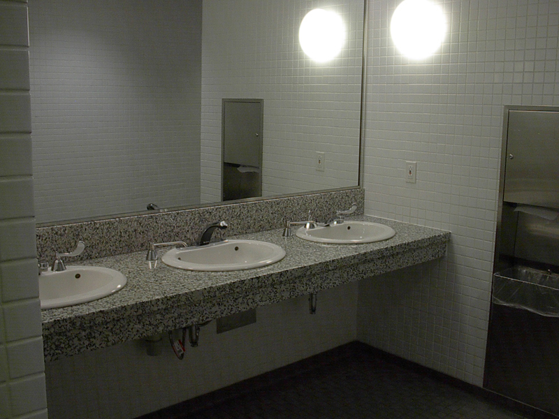
Image taken by Ryan Rattos
Appendix K
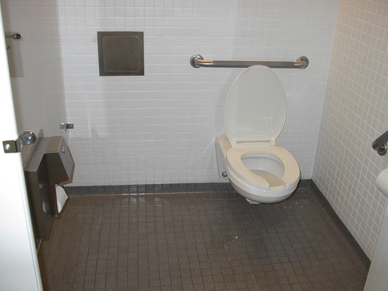
Image taken by Ryan Rattos
|