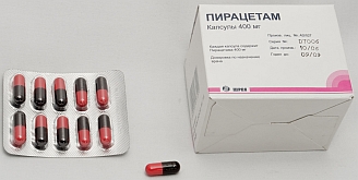


The labels on medication are highly regulated with strict laws on what information must be shown. But given such limited space to fit it all on, the majority of labels have become highly unreadable. This affords ergonomists the opportunity to examine how fine-print taxes the visual system. Linguists and professional writers can also evaluate the language used.
Unfortunately, it's hard to give directions in user-friendly language if there's no room to do so.
Legally, package inserts are the answer, but user testing has shown that many people discard both the medication's box and its papers.
Concise, precise, patient-friendly writing, written right on the container, is the best way to ensure patients take medication the way they're supposed to. Visibility and print size are critical