4.0 Facilities
|
|
4.3 Cafeteria
Getting to the cafeteria involves going back down the elevator (see elevators), and through another broad hallway. This hallway is illustrated in Appendix O. Although not too obvious in the picture, the lights are somewhat dim. Increasing the brightness would be beneficial for any employees who have partial vision. In addition, the large black poles may be problematic. Although they are highly contrastive in relation to the color of the walls, they could be problematic for the blind. Similar to the pylon in the middle of the entrance hallway, no one expects there to be any object in the middle of a hallway. This is a design feature that can not be overturned at a cheap cost. In order to get rid of the poles, some major construction would be necessary. Although they look aesthetically pleasing, the poles were included by designers who may have not been considering the visually-impaired.
|
Appendix O
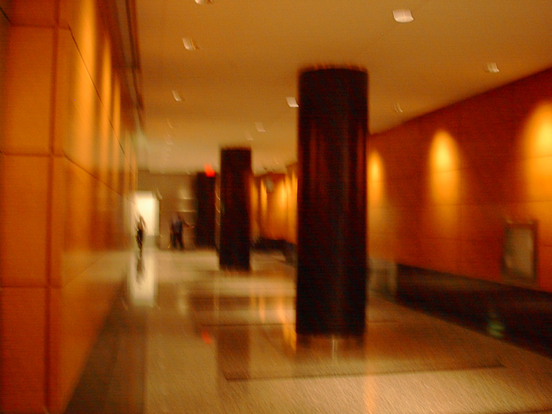 Image taken by Ryan Rattos
 |
Appendix P
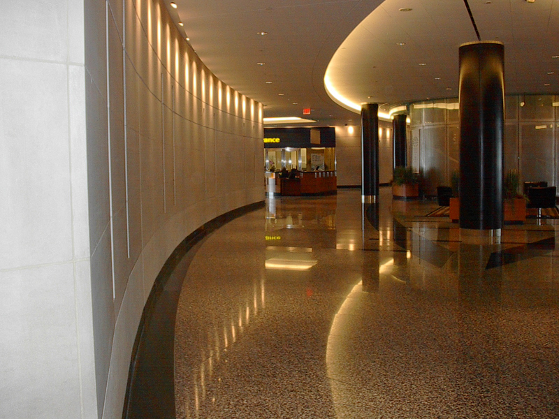
Image taken by Ryan Rattos |
Appendix P illustrates the main concession area located right before the cafeteria. Unless there was a tactile map, the visually impaired would have a difficult time locating this vital area. Sounds and smells are important design features that must be considered when designing for people with low or no vision (Cantrill, 2004). A possible solution would be to include an indoor waterfall surrounded by a garden. Appendix Q illustrates how a waterfall could be implemented indoors, while maintaining the aesthetic appeal of the design. Implementing a waterfall into the main concession area right before the cafeteria would allow employees who may be blind to follow the |
sounds of the waterfall. At the same time, a garden may help these employees use their sense of smell as well. Right now, the only way to for employees who are blind to distinguish whether or not they are headed in the cafeteria's direction is to listen to the echoes of people's voices. However, there may be only some parts of the day where this works. For instance, when it is not lunchtime, there may not be a lot of voices for a blind employee to base their navigation on. Although implementing a waterfall and garden may be somewhat expensive, it includes employees with visual impairment on a more direct level. The waterfall would be on all day and following the sounds of it is a great indicator of where the main concession area is. At the same time, a waterfall and garden can enhance a design's aesthetic qualities. In this case, the equitable principle is met by including a more diverse range of employees, while not taking away from the aesthetic appeal. |
Appendix Q
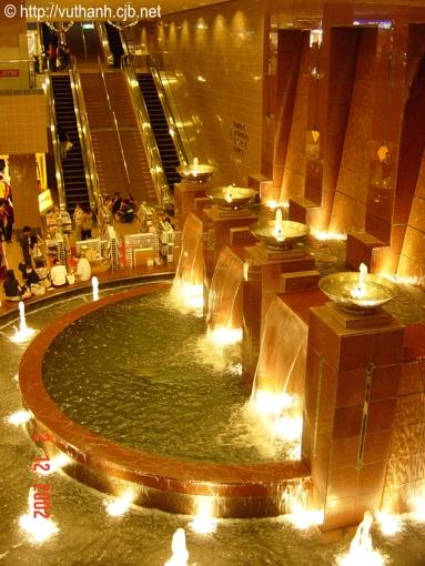
Image taken from http:// vuthanh.cjb.net
|
Appendix R
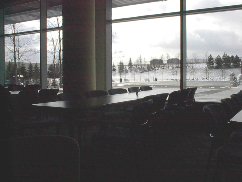
Image taken by Ryan Rattos
|
Seating in the cafeteria is depicted in Appendix R. This is a typical table where employees can sit during their lunch breaks. There are no specific wheelchair accessible tables. However, the tables are high enough so that a wheelchair could fit in underneath. Thus, employees in wheelchairs have accessibility. Employees who are visually-impaired may find it difficult to get around in this cafeteria because of contrast levels. Everything in the cafeteria is reasonably dark. The carpet and chairs are dark blue, and the tables are black. Highly contrasting colors would make it easier for the visually-impaired to distinguish the important design features (Novitski, 2001). For instance, if the table and chairs were contrasting colors such as black and white, the usability for this category of people would increase. Once this is done, the cafeteria would adhere to the equitable use principle more efficiently. |
5.0 Conclusion>> |
|