Chapter 3 Descriptive statistics
“Descriptive statistics” is just a fancy term for describing patterns in the data that we are working with. It contrasts with “inferential statistics,” in which we try to understand how confident we should be that the patterns we see are representative of a larger population. We use descriptive statistics to explore data, create summaries, and visualize data.
It might not be immediately obvious why we need to talk about “how” to look at data. It turns out there are many different ways to summarize and visualize data, and the way that we choose to present it can affect the interpretation. As a data analyst, it is your job to think about how you can describe the data in a way that most effectively answers a question or makes clear the patterns you would like to highlight.
There are several ways we can describe data in ways that can help us better understand and communicate the patterns we see. The primary tools we will use in this class are: 1) distributional patterns, 2) measures of central tendency and 3) measures of dispersion, or variability. If you would like a more thorough introduction to these concepts, I recommend reading Navarro (2018) Chapter 5.1-5.3.
3.1 Distributions
A distribution of data just refers to any set of values; for example, the values of your outcome variable that you have collected and now want to analyze. To start, we’ll focus on distributions of continuous data, using as an example this set of 100 hypothetical test scores.
##   [1] 31 33 34 34 35 35 36 36 36 36 37 38 38 38 40 40 41 42 42 43 43 43 43 44 44 44 44 45 45 45 45 46 46 47 47 47 47
##  [38] 47 47 48 48 48 49 49 49 49 50 50 50 50 50 50 50 51 51 51 52 52 52 52 52 52 53 53 53 53 53 53 53 54 54 54 55 55
##  [75] 55 56 56 56 57 57 57 57 58 58 58 59 59 59 60 60 60 61 63 63 63 64 64 66 70 70
3.1.1 Visualizing distributions
There are different ways to visualize distributions: below are some examples.
- Points: You can just plot the values directly as points. Here, I’ve “jittered” the points up and down a bit, and made them transparent; otherwise, you wouldn’t be to tell that there are, for example, lots of datapoints with a value of 50.
- Histogram: A histogram provides a more helpful way of seeing how much data there is for different values of the variable. Each bar on the histogram represents a “bin” with a given width (in this case, 2), and the height of the bar shows how many points fall into that bin. In this case, it makes it easier to see how there are a large number of points falling near the middle of the distribution (around 50-54). You can also see that there are 2 points falling around the value of 70.
- Density plot: A density plot is a “smoothed” version of a histogram. Like a histogram, it shows the “density” of the data at a given value, but gives a continuous approximation instead of actual counts. In this example, you can see that the density plot follows the basic shape of the histogram, with a small bump around 35 and the most dense portion falling a bit over 50.
- Boxplot: A boxplot summarizes the distribution by showing the quartiles of the distribution. This is done by dividing the (sorted) values into 4 parts (quartiles), which correspond to the 4 parts of the boxplot (the middle two parts of the box separated by the line in the middle, and then the “whiskers” coming out of the box). In this case, where there are 100 data points, the boxplot tells us that there are 25 datapoints in the left “whisker” (i.e. with values between 31-44), 25 datapoints between 44 and 50, etc.

Think about how these different ways of visualizing distributions compare.
- Which give the most information?
- Which make it easiest to extract summary information?
- Which is the best way of representing data? (Hint: there is no right answer, but some ways can be more useful than others, depending on the situation)
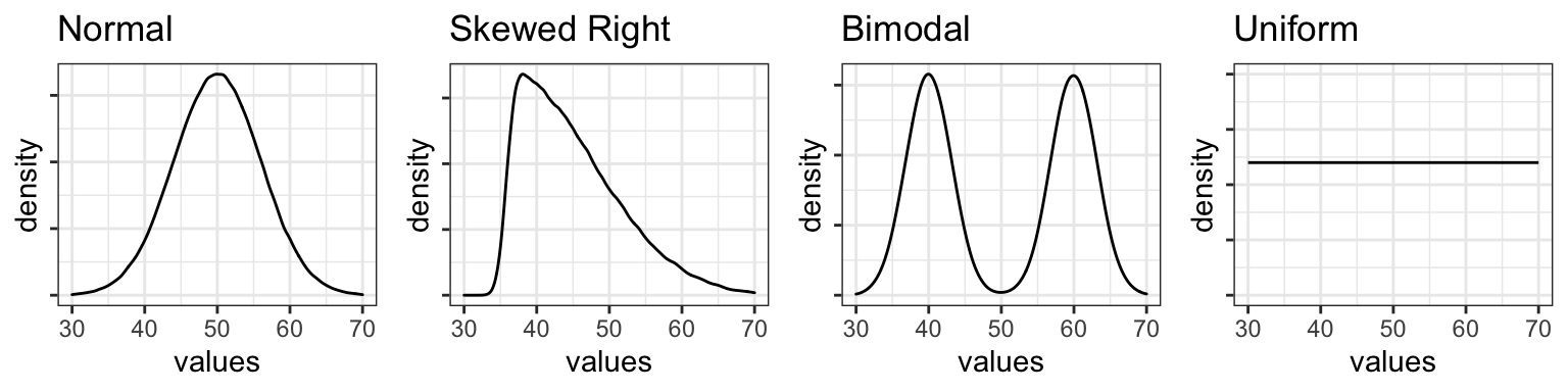
3.1.2 Shapes of distributions
We can classify distributions of continuous data in terms of their general shape as shown in a density plot or histogram. Density plots for the following types of distributions are shown below.
- A normal distribution is bell-shaped, with most values falling in the center, and with those values on either side decreasing in frequency.
- A skewed distribution differs from a normal distribution in that there are more values on one side than the other.
- A bimodal distribution has two peaks, or “modes.”
- A uniform distribution is flat: in other words, values occur with equal frequency across the range of the variable.
3.2 Summary statistics
In general, there is a tradeoff between the amount of information and how easy it is to interpret. Showing the raw data of a distribution will often technically give the most information, but it is difficult to make a concise, quantifiable statement about it that allows it to be compared with other distributions. As we saw with the graphs above, certain types of graphs (like boxplots) provide a clear visualization of certain meaningful aspects of the distribution, such as the range, quartiles, and median. We can also calculate summary statistics directly, including measures of central tendency (averages) and dispersion (variability).
3.2.1 Central tendencies
Measures of central tendency are metrics that we think of as “averages,” and which try to sum up the overall value of a distribution with a single number. There are several ways to do this.
3.2.1.1 Mean
The mean is what people are usually referring to when talking about the “average” value (both in data analysis and in the real world). To get the mean of a distribution, add up all the values and divide by the number of values.
In R, you can calculate the mean by hand, or use the built-in mean() function.
If there are any NA values in the vector, R will return NA as the output if you try to calculate the mean. To exclude the NA values from the calculation (and get a real answer), include the argument na.rm = T (stands for NA remove = TRUE).
x = c(1,3,5,6, NA)
mean(x)           # this will result in an output of NA
mean(x, na.rm=T)  # this will result in an output of 3.75
Remember that you can also see the mean (and the median) of a continuous variable in a dataframe with the summary() function.
##               family    num.langs     num.speakers
##  Afro-Asiatic    :1   Min.   : 447   Min.   :   4
##  Austronesian    :1   1st Qu.: 456   1st Qu.: 461
##  Indo-European   :1   Median : 476   Median : 600
##  Niger-Congo     :1   Mean   :1034   Mean   :1042
##  Other           :1   3rd Qu.:1380   3rd Qu.:1235
##  Sino-Tibetan    :1   Max.   :2641   Max.   :3300
##  Trans-New Guinea:1
3.2.1.2 Median
The median is the value that splits the data in half, such that half of the data is above and half of the data is below the median. It is therefore the middle value when the distribution is ordered (or, if there is an even number of values, it’s the average of the two middle values).
3.2.1.3 Mode
The mode is the most frequent value in a distribution. There can be multiple modes if there are multiple values “tied” for the highest frequency.
3.2.1.4 Which measure of central tendency to use?
Since we have different types of averages, does it matter which one we use?
The first thing to notice is that the different measures can often result in very different values. If you look at the summary of the nettle data above, you’ll see that in the num.langs column, the median number of languages per family is 476, while the mean is 1034. That’s a big difference!
The reason for these differences is that each represents a different conception of “central tendency.” So how do we know which one to choose? None of the choices in inherently better, but each captures a different conception of central tendency: you can think of the mean as the centre of gravity, or balance point of the data, whereas the median is the middle value, and the mode is simply the value that occurs most frequently. Which one to choose can depend on the situation and the type of distribution.
The mode is probably the least-used measure of central tendency, because it ignores all of the data except for the value(s) with the highest frequency. Usually, we want to capture more information about a distribution. However, considering the mode(s) is important and necessary in the case of bimodal distributions.
More often, we use the mean or median. In a symmetrical distribution, the mean and median are the same, but in a skewed distribution, or one with outliers, they can be different. There is not an answer to which is “better,” but in some instances the median may be more representative of the data than the mean (see example below). Most inferential statistical analysis is based on using the mean as the central tendency, so it is important to keep this difference in mind.
The plots below show the mean, median, and mode(s) of the distributions plotted above. As noted above, for the normal and uniform distributions, the three central tendencies all have the same value, and for the bimodal distribution, the mean and median are the same, while the modes are different (and probably the most representative way to describe the data). In the skewed distribution, the three central tendencies are different, but note that the mean and median are still fairly similar, even in this skewed distribution. Below, we will see an example of where the mean and median differ more substantially.

3.2.1.5 Mean vs. median: example
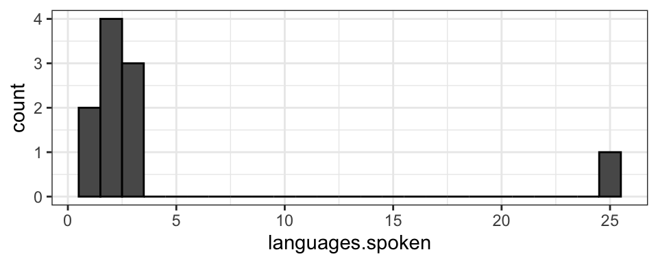
Let’s say that as a linguistics major, you are tired of everyone asking “Oh, you’re a linguist? How many languages do you speak?” and decide to try to get a concrete answer to the question so you can say something other than “Well, Linguistics isn’t really about being a polyglot…” You poll 10 linguists, asking how many languages they speak fluently and get the data shown in the object below: 2 were monolingual, 4 were bilingual, 3 were trilingual, and one linguist reported speaking 25 languages (a true polyglot!). The data is shown in the histogram below.
If you calculate the mean and median, they will be quite different. Before calculating them, think of how you expect them to be different.
You’ll see that the median is 2 languages (which makes sense, since it’s in the middle of the ordered list), and the mean is 4.4 languages. Which is a more accurate answer to a question about how many languages linguists generally speak. The mean, 4.4, might not feel super representative since that’s actually more languages than 9/10 of the linguists we polled speak! The median, 2, might seem like a better representation in this case. However, it doesn’t take into account the large number of languages spoken by the polyglot at all (if the polyglot only spoke 5 languages, the median would be the same as it is when they speak 25), which also might not be ideal. There’s no perfect answer, but it’s important to be aware of the differences and the reasons behind them.
3.2.2 Dispersion
Along with the “average” or “middle” value of a distribution, as with the central tendencies above, another important property of a distribution of data is how disperse, variable, or “spread out” the data is. Like central tendency, this can be calculated in several ways, with each way giving different types of information about the distribution.
3.2.2.1 Range and interquartile range
The range gives the minimum and maximum values of a dataset. In the example above, the number of languages spoken by linguists ranges from 1 to 25. You can get the minimum and maximum separately, or both using the range() function
Sometimes, the range can be somewhat misleading since it only considers the very lowest and very highest values of a dataset. This can be particularly problematic if there are outliers or extreme values, making the range seem much bigger than it is for most values. The interquartile range, or the range of the middle 50% (middle two quartiles) of the data, or what is seen in the box part of a boxplot, is another way to quantify dispersion that mitigates this issue somewhat. The interquartile range can be found by looking at the “1st Qu.” and “3rd Qu.” values in the summary() function; in this case, 50% of linguists surveyed speak between 2 and 3 languages.
##    Min. 1st Qu.  Median    Mean 3rd Qu.    Max.
##     1.0     2.0     2.0     4.4     3.0    25.0
3.2.2.2 Standard deviation
Standard deviation is probably the most commonly used measure of variance. Although it’s a little more complicated than this, you can think of standard deviation as how far, on average, the data points are from the mean. Datasets that are more spread out will have larger standard deviations than datasets that are more compact. You can calculate the standard deviation using the sd() function. By itself, standard deviation might not be intuitive to interpret, but its meaning becomes more clear when comparing across datasets with different amounts of variability.
Note that standard deviation is not the same as standard error, which is what is often shown as “error bars” on graphs. This is another, slightly more complicated, measure of variance that we’ll discuss later, but for now, just be aware that these are two different things.
## [1] 7.275533.2.2.3 Variability: Example
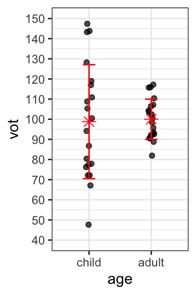
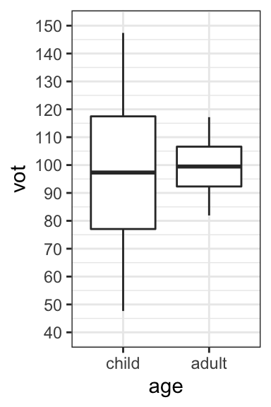
Children’s speech tends to be more variable than that of adults. There are multiple possible reasons for this: their vocal tracts are still developing, they’re learning to use their articulators, and perhaps their phonological representations are not as fossilized. One place where more variability has been found in children than adults is Voice Onset Time, or the duration of aspiration in voiceless stops.
Consider the hypothetical data representing the VOT values of Mandarin-speaking children and adults, with both raw values and boxplots.
Note that the mean (as shown in red on the graph of raw values) of the two age groups is very similar, as is the median (as you can see from the boxplots). What differs between the two groups is not the average value of VOT, but rather the amount of dispersion or variability:
- Children have a larger range of VOTs than adults (as is clear in both graphs).
- One standard deviation above and below the mean is also shown in red in the graph of raw values.
- The standard deviation is larger for children (28.29) than for adults (10).
3.2.3 Categorical data: distributions
This section has focused on distributions of continuous data thus far. What happens when we want to consider a categorical outcome variable? For example, let’s say you were interested in studying the use of ‘eh’ in Canadian vs. US English. You have a dataset in which you had tracked whether ‘eh’ was present or absent in 25 sentences (where it would be appropriate to use it) spoken by Canadian and US English speakers. You code those sentences where it is present as 1 and those where it is absent as 0 (a case like this where the variable can take on two values is called a binomial variable). You get the following values, and you want to plot the distributions.
## [1] 0 0 1 1 0 0 1 1 1 1 0 0 1 0 1 1 1 1 1 0 1 1 1 1 1## [1] 0 0 1 0 0 0 0 0 0 0 0 0 0 0 0 0 0 0 0 0 0 0 0 0 0Plotting these in the same way as our continuous distributions doesn’t work so well - you can try for yourself and see. To give an example, look at the histogram below. It’s accurate, but not a very efficient use of space since the only values this variable can take are 0 or 1. Another way to think about it is that we already know the “shape” of the distribution, because values can only occur at two points. What is important is instead the relative frequency of the different values; in this case showing that Canadians used eh 17/25 = 68% of the time, while US English speakers used it 1/25 = 4% of the time.

We can also calculate summary statistics like central tendencies and standard deviation of a binomial distribution. Which measure of central tendency makes the most sense for a binomial distribution like this one?