Chapter 5 Linear models of relationships between variables
For more in-depth discussion of this topic, please see Winter (2019), Chapter 4, from which the data and many examples here are taken
Chapter 2 showed that many research questions can be framed as asking whether there is a relationship between two variables X and Y. The prose questions below give some examples we’ve seen before, and potential outcome and predictor variables.
| Question | Outcome variable | Predictor variable |
|---|---|---|
| Does f0 (pitch) differ between formal vs. informal speech? | f0 | Speech formality level |
| Does the discourse marker “like” affect perceived intelligence? | Intelligence rating | Presence/absence of ‘like’ |
| Are more morphologically complex words acquired later by children? | Morphological complexity | Age of acquisition |
There are many different ways to visualizing these relationships, as shown in Chapter 4. In this chapter, we’re going to focus on understanding the relationship in a way that will exactly correspond to the statistical analysis we will eventually learn. The graphs you will see here are not the ones you will usually want to use to present the data, so I do not always present code for how to make them; the purpose of this chapter is to get a conceptual understanding of how we will be modeling the data in future weeks.
To test whether a relationship between variables is meaningful, or significant, using inferential statistics, we will be using what are called linear models. This sounds fancy, but the concept is actually pretty simple. If we have a set of data and have measurements from two variables, we plot the relationship between the two variables on an x-y plane, then we make our “model” - which is simply the straight line that most closely fits the data. That’s it - really! After we have the model, we make some educated inferences about how much we can trust our model, and in turn how confident we can be that there is actually a meaningful relationship - which is the answer to our research question.
In this chapter, we will focus on modeling the relationship between two variables.
5.1 Lines
So we have to go back to math class very briefly and remember how a straight line is defined. A straight line plotted on an x-y axis can be defined by the equation \(y = \beta_1x+\beta_0\) (you may remember seeing this as \(y = mx+b\), which is the same thing, just with different names for the variables!)
- \(\beta_1\) is the slope: how much does y change for every one-unit change in x? A slope of zero is a flat line, a positive slope tilts upwards, and a negative slope tilts downwards.
- \(\beta_0\) is the y-intercept: where does the line cross the y-axis?
The figures below show lines differing in slope on the left (all have a y-intercept of 1) and lines differing in y-intercept on the right (all have a slope of 1/2).


5.2 Fitting a line to a scatterplot
We will usually be modeling what we call linear relationships between variables. From a visual point of view, this means we will be trying to find the straight line that best fits the two variables plotted against each other, as in a scatterplot. This line, called the regression line, is our linear model! An example is shown below.
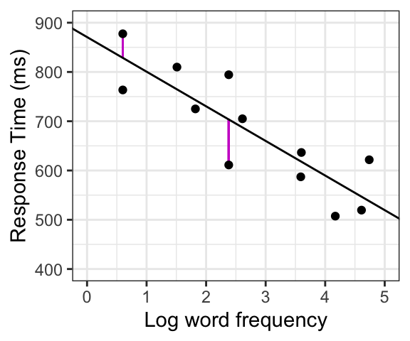
There is (almost) never going to be a line that is a perfect fit to the data - some or all of the points will be at varying distances from the line. The vertical distances between each actual datapoint and the line (shown in purple in the second figure), called residuals, can be thought of as errors, because the predicted value of our model differs from the actual value of the datapoint. The regression line is the one that comes closest to all the data points by minimizing the average error across all the datapoints. The slope represents the direction and magnitude of the relationship between the variables.
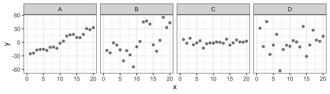
Below are examples of four different datasets, shown with raw scatterplots (top) and fitted with their best-fit regression lines (bottom). In determining the relationship between the variables, it is useful to look at two elements of the line: its slope and its goodness of fit.
- Slope indicates the direction and magnitude of the relationship: A and B show positive relationships: \(y\) tends to have higher values as \(x\) increases, whereas in C and D, \(y\) does not differ systematically based on the value of \(x\)).
- Goodness of fit: There are substantial differences in how well the line fits the data in A vs. B, even though the two have similar slopes (and same goes for C vs. D). Overall the points are further from the line, or there is more “error” in the model, for B and D as compared with A and C.

5.3 Examples: Modeling linear relationships
Our goal is to model whether and to what extent two variables are related; in other words, does the value of the outcome variable differ systematically based on the value of the predictor variable? We do this by finding the straight line that best “fits” the set of data. This line is then our model of the data. It both can be used to quantify the relationship between the two variables and can be used to come up with concrete predictions of which values for the outcome variable are expected for any value of the predictor variable.
Here we will look at examples of how this works for cases of a continuous outcome variable and predictor variables that are either continuous, or categorical with two levels. We will return to other cases (categorical outcome variables, multi-level categorical predictors) in the future.
For all of the examples, we can show how one variable is related to another by plotting one on each axis: we will plot the outcome variable on the y-axis and the predictor variable on the x-axis. We will plot the raw data as points, then find the best-fit regression line and discuss how to interpret it.
5.3.1 Continuous outcome, continous predictor
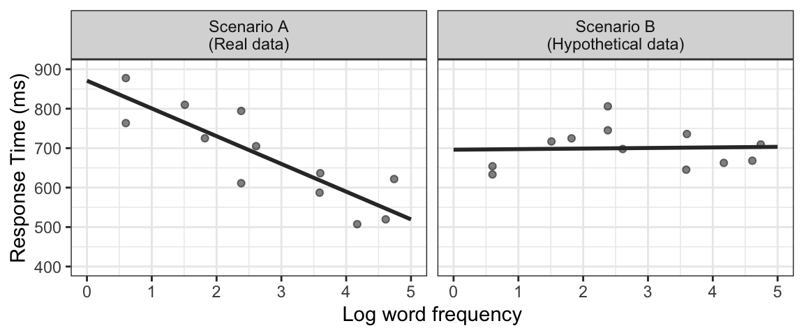
Let’s consider the relationship between Response Time (RT, how long it takes for people to decide whether something is or is not a word) and the frequency of the word (how often it is used, on a logarithmic scale). Let’s say we have a dataset of 12 words, with the average frequency and response time for each. First, we plot the data with the outcome variable (RT) on the y-axis and the predictor (Frequency) on the x-axis. Two possible scenarios are shown (the first is real data, taken from Winter (2019); the second is hypothetical data: the same words but with made-up response times, just for demonstration purposes).
For the data in the first panel (the real data), we can see that overall, for more frequent words (i.e. higher x-values), RT is shorter (so responses are faster, i.e. lower y-values). The negative slope of the regression line reflects this relationship. On the other hand, if we would see a scenario such as in the second panel, where the slope of the regression line is close to zero, we would conclude that in this sample, there is no systematic relationship between RT and word frequency.
Another way to think of this is that when there is a relationship (as in the first panel), we can make predictions about how fast we expect RT to be for different word frequencies (we expect it to be faster for a more frequent word). On the other hand, if the slope of the line is zero, showing no relationship, we would not be able to make any predictions about RT based on word frequency, since the predicted RT is always the same regardless of frequency.
5.3.2 Continuous outcome, categorical predictor
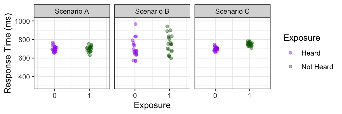
What if our predictor variable is categorical? For example, we might be interested in whether response time is faster when there has been recent exposure to a word, and we could test this by measuring response times to words that have already been heard in an experimental session to those that have not. In this case, our (continuous) outcome variable would still be RT, and we can call our predictor variable “Exposure”, with 2 levels: Heard and Not Heard.
Three hypothetical scenarios are shown in the plots below, with just the raw data on the top row, and regression lines added on the bottom. As before, the outcome variable (RT) is on the y-axis, and the predictor (Exposure) is on the x-axis. The points are slightly jittered so you can see all of them, but the values for X are categorical: they can only be one of two values. Just so we’ll be able to more easily conceptualize how the line is drawn and how the slope is calculated, we can put the predictor on a numerical scale, coding “Heard” as 0 and “Not Heard” as 1 (the choice of which is 0 and which is 1 is arbitrary; we could switch them, or use any other numbers, and the outcome will be the same).
It might not seem as obvious to try to draw a best-fit line through this kind of data, but mathematically it works exactly the same way: the best-fit regression line is that which will minimize the error between the line and the points.
Comparing the the three scenarios below, we can see that in Scenario A, there does not seem to be an overall difference between Heard and Not Heard words, and this is reflected by the regression line with a slope of about 0. In Scenarios B and C, overall words that were heard before have faster (shorter) response times than those that were not: in other words, there is a positive relationship between RT and the predictor variable.
In cases of a binary categorical predictor like this one, there are also a couple of special properties that will always hold: First, the line will always pass through the mean of each category. Second, since we have set the categories at 0 and 1, the slope will be the difference between the means of the two categories. In both Scenarios B and C, the mean RT for Heard words was around 700, and for Not Heard words is around 750: a difference of 50 ms. 100 is also the slope of both regression lines. So for these two scenarios, the magnitude or size of the relationship is actually the same. However, there is a difference that is clearly visible in the data, and this is that the points are clustered more closely together, or there is less variability, in C than in B. This corresponds to goodness of fit of the line. You might have the intuition that the difference is somehow more obvious or meaningful in Scenario C than in B, even though the regression lines show the same relationship for the two scenarios. This intuition will be incorporated (in a quantifiable way) when doing statistical inference.

Side note: non-linear relationships
When trying to model relationships, we will almost always be modeling the relationship in the form of a straight line. This is also what the vast majority of statistics do. Before we start, though, it’s important to note that this is not the only possible relationship. If, you expect for some theoretical reason a non-linear relationship, or, when looking at your data, you see a strong relationship that is clearly not linear, you don’t want to use a linear model to try to approximate the data. The example below shows hypothetical data about happiness (as self-reported on a 10 point scale) and how it is predicted by number of hours worked per week. The best-fit regression line is shown, but it does not look like a very good fit! This is because the relationship does not appear to be linear at all (instead, it’s quadratic) - and there are good real-world reasons to expect that! In this case, a linear model would not be a good choice to model this data.

5.4 Linear models: summing up
This chapter showed how the relationship between two variables can be modeled by finding the straight line that best fits the data. We showed examples of how this works for a continuous outcome variable with either continuous or categorical predictor variables (we will address categorical outcome variables in the future).
If the two variables are plotted in the x-y space, the slope of the best-fit regression line can be used to quantify the direction and magnitude of the relationship:
- A slope of zero indicates no relationship.
- The larger the (absolute value of the) slope, the stronger the relationship.
We’ve also seen that the slope of this line does not capture all of the relevant information about the relationship: in particular, regression lines with the same slope can have different “goodness of fit” to the data.
What we have not addressed is how we can tell whether this relationship is meaningful. It’s very rare to see a regression line with a slope of exactly zero, so there is almost always a numerical relationship. But how do we know if this relationship is meaningful, or just a quirk of the data? In the coming weeks, we will use inferential tools to quantify how reliable, or how meaningful, this relationship is.