Chapter 4 Data visualization
The saying “a picture is worth a thousand words” really holds true when dealing with quantitative data. A large part of data analysis involves looking for or inspecting patterns in the data, and it can be a lot easier to do this with graphs or other visuals.
There are always many different possible ways to present data visually, and usually, some ways are more effective than others in getting your point across. There’s not a single easy answer for what is the “best” way to graph data, because the best choice will depend on the particular question and data.
There are different ways to make graphs in R. We will be using a package called ggplot2, which is included in the tidyverse package, so as long as you have tidyverse loaded, you are set. The ggplot syntax can seem a little intimidating at first, but once you understand the structure, it is very efficient, and you will never go back to making graphs in Excel!
4.1 Basic structure
The basic way that ggplot plots work is by creating a base grid that sets up the x and y axes of your graph, then adding “layers” of data with whatever kind of plot you want (e.g. points, boxplots, bar plots).
Every plot requires the following components:
ggplot(), which tells R which dataframe to use and which sets up the grid.- Included in this is aes() (stands for “aesthetics”), which sets up the x- and y-axes
geom_X(), where X refers to the type of graph you want to make (boxplot, histogram, etc.)
You can modify these commands too add colors, shapes or line types that can help highlight patterns of interest in the data.
You can also add additional components to split the graphs into different “facets” containing different subsets of data, and to change the labeling of the graphs.
Below are some examples of basic ggplot functions. If you would like a more thorough introduction to ggplot, I recommend the following resources:
- Chapter 2 of Wickham et al.: Please read these sections carefully and do all of the accompanying exercises. The more comfortable you get with graphing now, the faster you will be able to do things in the future.
- An intro to ggplot2 by Eleanor Chodroff
- This cheat sheet may also be helpful as a resource.
4.2 Plotting continuous variables
Korean has a three-way laryngeal contrast in stops (fortis, lenis, aspirated).
| fortis | [p’ul] | 뿔 | “horn” |
| lenis | [pul] | 불 | “fire” |
| aspirated | [pʰul] | 풀 | “grass” |
One way these sounds differ is in their voice onset time (VOT).
The dat.kor object contains the average VOT (vot) for each stop category (cat) for 191 Korean speakers. Their birth year (yob) is also included. You can see the first 6 rows (i.e. the data for the first 2 speakers) below. The data comes from work reported in (Kang, Schertz, and Han 2022).
## # A tibble: 6 × 5
## # Groups:   speaker, cat, gender [6]
##   speaker cat       gender   yob   vot
##   <fct>   <fct>     <chr>  <int> <dbl>
## 1 S1      fortis    M       1940  46.9
## 2 S1      lenis     M       1940  25.4
## 3 S1      aspirated M       1940  96.9
## 4 S10     fortis    F       1947  21.9
## 5 S10     lenis     F       1947  25.2
## 6 S10     aspirated F       1947  90.5
4.2.1 Histograms and density plots
Histograms and density plots are similar ways of showing the distribution of a single continuous variable. The two plots below show the distribution of VOTs of aspirated stops in Korean.
In a histogram, the data are divided into equally spaced bins. The x-axis shows the values, and the y-axis shows how many datapoints are in each bin. In the example below, you can see that there are few datapoints the shorter and longer values of VOT, but lots of datapoints in the middle.
A density plot is like a histogram but is “smoothed.” In other words, it gives an estimate of how the data is distributed. Unlike a histogram, it is difficult to interpret the y-axis in a concrete way, but it gives a sense of the relative quantity of data at different values; in this example, we can see that there is a large amount of data concentrated around the middle (~80 ms). The overall shape of the density plot reflects the overall shape of the histogram.
Note that the two graphs created with identical commands, except for the geom_X component in the last line. The first line of the command is just creating a subset of data for aspirated stops only; the second and third lines are the two ggplot commands.
dat.kor %>% filter(cat == "aspirated") %>%
  ggplot(., aes(x = vot)) +
  geom_histogram()

dat.kor %>% filter(cat == "aspirated") %>%
  ggplot(., aes(x = vot)) +
  geom_density()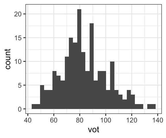

4.2.2 Boxplots
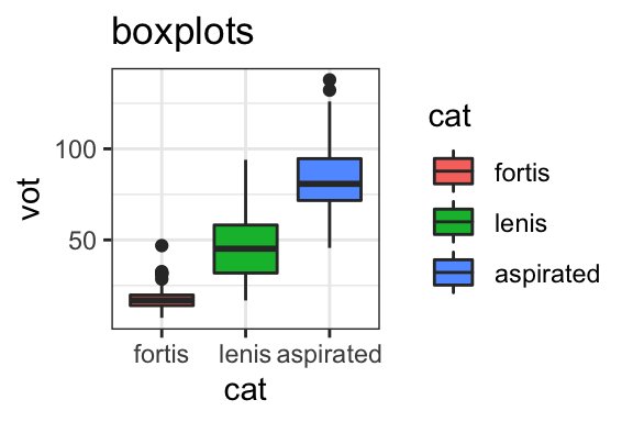
Boxplots summarize a distribution of data by showing the quartiles of the data; the middle line shows the median, such that half the datapoints are below and half the datapoints are above the line, and the upper and lower borders of the box show the quartiles, such that that the top and bottom 25% of data is in the “whiskers” of the plot. You may also see dots indicating what R considers to be “outliers” or extreme values.
The concise nature of boxplots makes it easy to compare across different categories. The plot below shows the distributions of VOT of the three different Korean stop categories side by side.

4.2.3 Bar plots
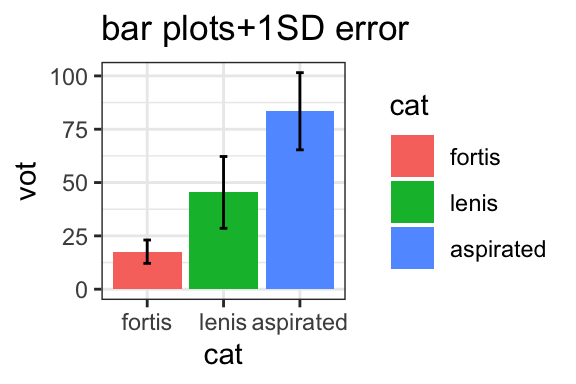
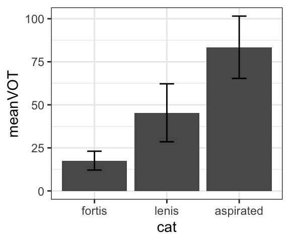
Bar plots show the mean values of a dataset. Sometimes you will see error bars, which can provide an indication of variability (in this case, the error bars show the standard deviation). Although they are commonly used, bar plots are generally less informative than boxplots because they only show the mean, not the distribution.
Barplots without error bars really only show a single value, the mean. Therefore, when creating the plot below, we first have to create an aggregated dataset that just contains the mean for each category using the group_by() and summarize() functions. You also have to include the argument stat="identity" to show that you want the barplot to show values, not counts.
dat.kor.aggregated = dat.kor %>%
  group_by(cat) %>%
  summarize(meanVOT = mean(vot), sdVOT = sd(vot))
dat.kor.aggregated
## # A tibble: 3 × 3
## cat meanVOT sdVOT
## <fct> <dbl> <dbl>
## 1 fortis 17.6 5.47
## 2 lenis 45.4 16.8
## 3 aspirated 83.4 18.1dat.kor.aggregated %>%
ggplot(., aes(x = cat, y = meanVOT)) +
geom_bar(stat="identity")
dat.kor.aggregated %>%
ggplot(., aes(x = cat, y = meanVOT)) +
geom_bar(stat="identity")+
geom_errorbar(aes(ymin=meanVOT-sdVOT, ymax=meanVOT+sdVOT), width=0.2)
4.2.4 Points and Scatterplots
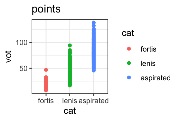
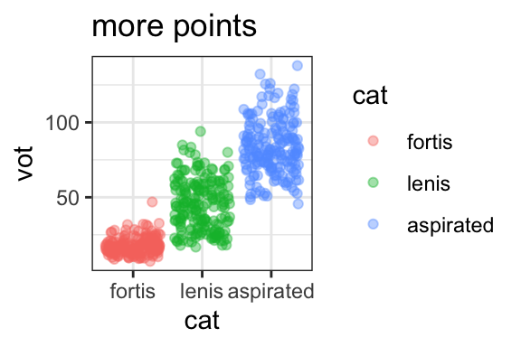
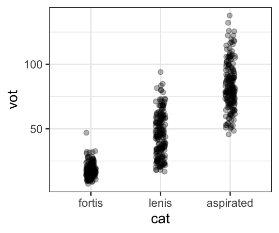
Another way to look at distributions of data is to simply plot all the datapoints. This is usually not the most informative way of comparing distributions of data, but sometimes it can be useful. If you have a lot of points with the same values, it can make it impossible to see all the points because they will be on top of each other, as shown in the first plot. One way to solve this is to use the geom_jitter() geom to slightly offset them, and/or to make them slightly transparent using the “alpha” argument.
dat.kor %>%
  ggplot(., aes(x = cat, y = vot)) +
  geom_point()

dat.kor %>%
  ggplot(., aes(x = cat, y = vot)) +
  geom_jitter(width=0.07, height=0, alpha=.3)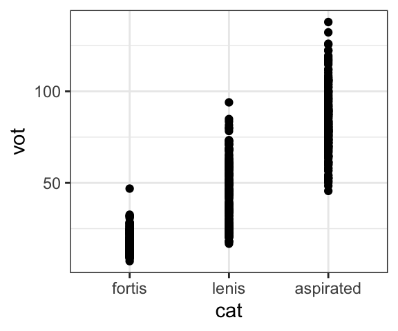
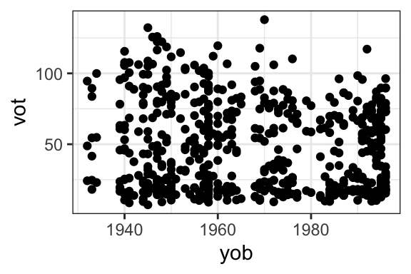
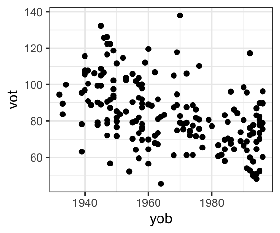
Points are, however, a very useful way to show the relationship between two continuous variables, via a scatterplot. The example below shows the relationship between the VOT of Korean aspirated stops and the speakers’ year of birth. Each point represents one speaker, with their VOT on the y-axis and their year of birth on the x-axis. The scatterplot shows that on average, as speakers are younger (higher year of birth), their VOT is shorter.
4.3 Facetting and colors
It is often useful to be able to see plots for different subsets of the data, separated in some meaningful way. For example, if we wanted to see density plots of VOTs, split up by stop category. We can visually separate data using facets, producing the same plot in different panels, or by using color, which allows us to compare across categories on the same graph. You can also use different shapes of points or different line types to differentiate data; see the further resources listed above for more information on these.
4.3.1 Facets
If we want to look at a histogram of the distribution of Korean VOTs, but looking at each stop category separately, we simply add the facet_wrap() command at the end, using the relevant column name as the argument. Compare the density plots of the full set of Korean VOT data (from fortis, lenis, and aspirated stops combined) with a graph where the three stop types are split up.
dat.kor %>%
  ggplot(., aes(x = vot))+
  geom_density()

dat.kor %>%
  ggplot(., aes(x = vot))+
  geom_density() +
  facet_wrap(~cat)

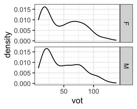
There is also a similar facet_grid() command that allows you to specify whether the different levels of the split category are along the same row, along the same column, or you can look at two variables together, in this case gender and stop category.
dat.kor %>%
  ggplot(., aes(x = vot))+
  geom_density() +
  facet_grid(.~cat)

dat.kor %>%
  ggplot(., aes(x = vot))+
  geom_density() +
  facet_grid(cat~.)

dat.kor %>%
  ggplot(., aes(x = vot))+
  geom_density() +
  facet_grid(gender~cat)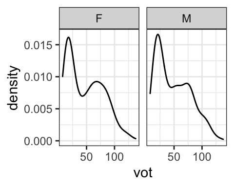

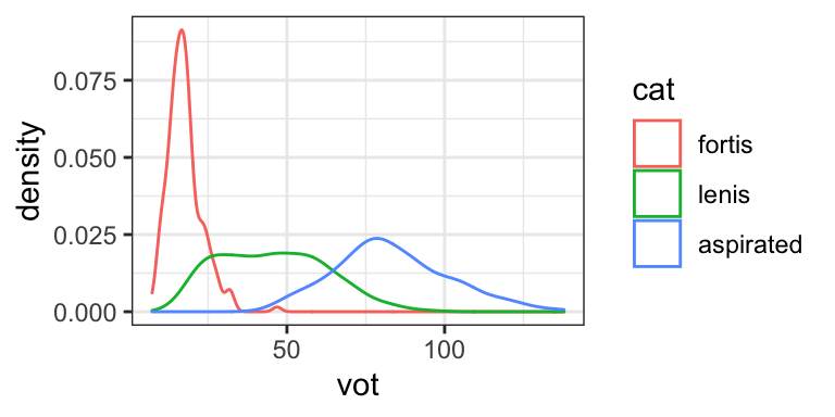
4.3.2 Colors
When colors are used to differentiate different levels of a factor, they are added in the aes() argument. There are two ways that color is added in R:
- the color argument: This controls the color of points, or the outline of shapes.
- the fill argument: This controls the fill color of shapes.
The examples below show the use of color in the density plots of Korean VOTs. The first plot shows the distribution of all VOTs, undifferentiated by stop type. In the second and third, color and fill arguments are used to separate the categories. The “alpha” argument in the third graph controls transparency, allowing you to see overlapping distributions.
dat.kor %>%
  ggplot(., aes(x = vot))+
  geom_density()

dat.kor %>%
  ggplot(., aes(x = vot, color = cat))+
  geom_density()

dat.kor %>%
  ggplot(., aes(x = vot, fill = cat))+
  geom_density(alpha=.5)

4.4 Axes
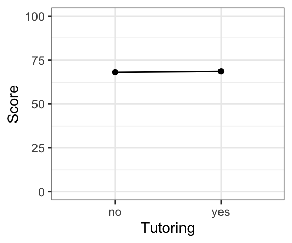
By default, the range of the x- and y-axes will be determined by the data. However, you will often want to control the axes. For example, consider the following (hypothetical) example of test scores (the test was out of 100 points) from a group of students who had vs. had not hired a tutoring service. Both of the plots show the exact same data, with only the scale of the y-axis being different. While the tutoring service might want to show the first plot, the second gives a more realistic view of the size of the difference.
You can adjust the limits for axes representing continuous variables by adding the xlim() or ylim() functions to your ggplot, as shown below.
dat.tutoring %>%
  ggplot(., aes(x=Tutoring, y=Score))+geom_point()+geom_line(group=1)

dat.tutoring %>%
  ggplot(., aes(x=Tutoring, y=Score))+geom_point()+geom_line(group=1)+
  ylim(c(0,100))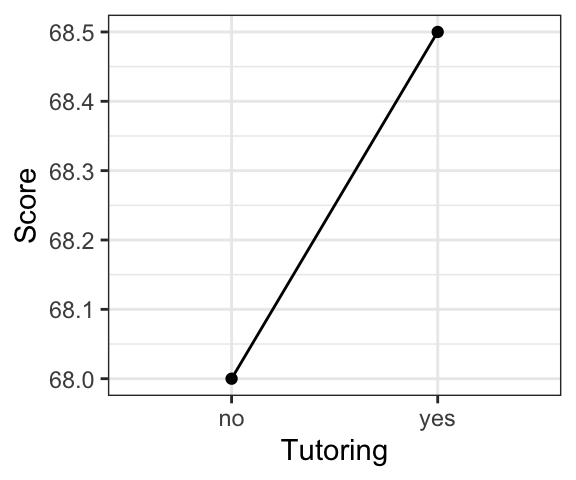
4.5 Plotting categorical variables
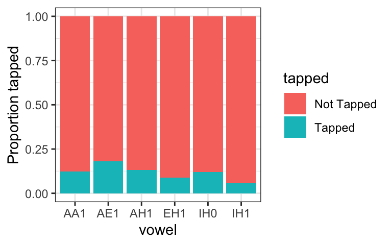
In American English, [t/d] can be produced as a tap [ɾ] preceding a vowel, but whether or not the sound is tapped (vs. produced as a /t/ or /d/) is influenced by various syntactic, phonetic, and prosodic factors.
The examples below, based on data from a production experiment reported in Kilbourn-Ceron (2017) and Kilbourn-Ceron, Wagner, and Clayards (2017), examine the relationship between tapping and the preceding vowel. Each row of the dataset represents one production, and the column ‘tapped’ indicates whether it was Tapped or Not Tapped.
##     participant trial vowel     tapped
## 290         435     2   AH1     Tapped
## 653         435     2   AH1 Not Tapped
## 135         435     4   IH1 Not Tapped
## 494         435     4   IH1 Not Tapped
## 112         435     5   AE1     Tapped
## 472 435 5 AE1 Not Tapped- Outcome variable: Whether the target sound is produced as a tap (categorical variable: Tapped or Not Tapped)
- Predictor variable: (preceding) vowel
How can we visualize this? The tools used above for continuous variables, which are focused on showing distributions, don’t work very well, since it doesn’t make a lot of sense to show the distribution when there are only two possible values (tapped or not tapped).
What we want to do is show some comparison of how often the target sounds are tapped for each vowel separately. We can do this with bar plots.
4.5.1 Bar plots: Raw counts
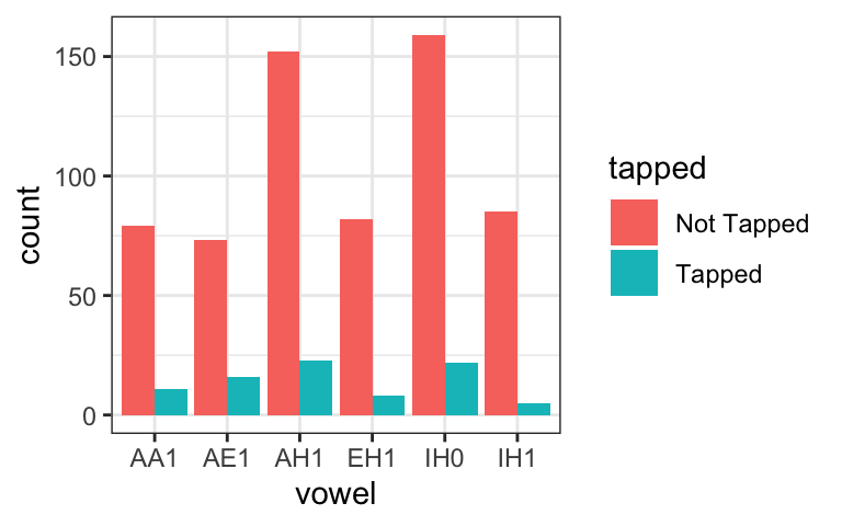
One possibility is to simply plot the number of tapped vs. not-tapped sounds for each category separately, using bar plots with different colors for tapped vs. non-tapped sounds. In these graphs, the x-axis shows the vowel and the y-axis shows the count. By default, the different variants are “stacked” on top of each other, so you can see the number of tokens for each vowel, as well as the breakdown of which were tapped vs. not tapped. You can also add the position = "dodge" argument to put the two categories side-by-side.
dat.tap %>%
  ggplot(., aes(vowel, fill=tapped))+
  geom_bar()

dat.tap %>%
  ggplot(., aes(vowel, fill=tapped))+
  geom_bar(position="dodge")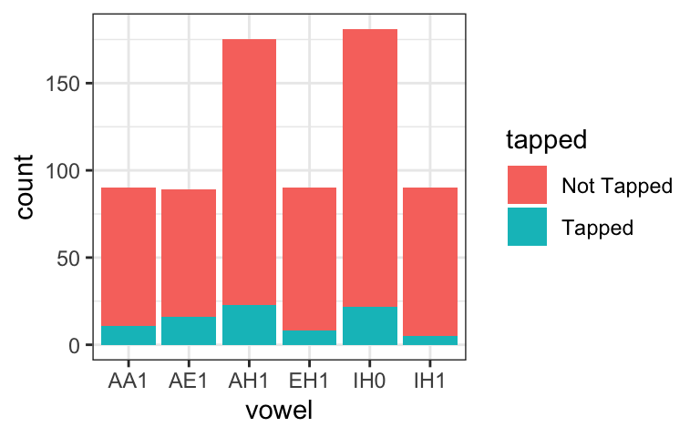
4.6 Choices to think about
Graphs can show raw data or summaries of distributions.
- Which kind of plots fit into each category?
- Which of these types of graphs give more information?
- Which are easier to interpret?
- Is it possible to include both?
What are the pros and cons of showing raw counts vs. relative proportions for categorical data?
4.7 Tips on making graphs
There are many different (accurate) ways to plot the same data. Which way is “best” can be subjective, but usually, for a given question, there are more and less effective solutions. The goal should always be to present the data in the way that makes it easiest to get your point across to the viewer.
I recommend spending time to think about your graph BEFORE jumping into the code, using the following steps.
- Identify the specific question you want to answer, or the specific relationship between variables you want to look at.
- What are the outcome and predictor variables?
- A good rule of thumb is to put the outcome variable on the y-axis and the predictor variable on the x-axis.
- If wanting to break it down into further subsets, or look at multiple predictor variables, use color and/or facetting.
- Draw a graph (by hand!) of the way you think would most effectively answer the question or demonstrate the relationship. This will help you determine:
- The type of graph you want (scatterplot? boxplot? bar graph?)
- What goes on the x- and y-axes
- What colors or facets you might want to use to divide up the data
- Then choose the appropriate ggplot code to create the graph you have drawn.
- Your graphs don’t need to win an art award, but don’t underestimate the importance of aesthetics! The design of your plots can strongly affect interpretation of results.
4.8 Describing graphs
You’ve figured out the perfect way to visualize your data, and you’ve spent hours debugging the code to make your graphs look exactly like you want. So you’re finished, right?
Actually, there’s one more important step, and that is being able to describe your graph. While it probably seems very clear and obvious to you after spending time thinking about it, it will not necessarily be obvious to someone looking at it for the first time. Being able to clearly explain a graph, in writing and orally, is critical to having your work be understood.
Your description should be concise, written in plain language, and include:
- What kind of graph it is (e.g., boxplot, density plot)
- Which variables are represented, and how they are represented (e.g., on axes, by color)
- The main idea you would like the viewer to take away from the graph.
The descriptions below refer to two of the graphs in the Examples section below: try to find them!
- These boxplots show the distribution of VOT of Korean fortis, lenis, and aspirated stops. VOT is on the y-axis, and stop type is on the x-axis, and stop types are also separated by color. VOT of fortis stops (in red) are the shortest on average, aspirated (in blue) are the highest, and lenis (in green) have intermediate VOT values.
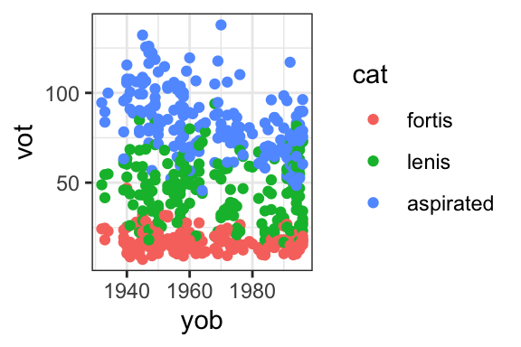
- This is a scatterplot showing the VOT of Korean stops (on the y-axis), plotted by the speakers’ year of birth on the x-axis. The stop type (fortis vs. lenis vs. aspirated) is shown in different colors. This graph shows that overall, aspirated stops have the highest VOT, followed by lenis, followed by fortis stops. The VOT of aspirated stops appears to be getting shorter on average for younger speakers.
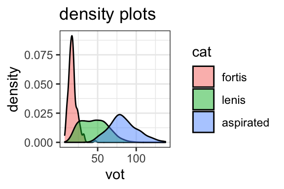
4.9 Examples: A summary
The examples below provide a concise summary of plotting the same data in different ways.
dat.kor %>%
ggplot(., aes(x = cat, y = vot, color = cat))+
geom_point()+ggtitle("points")
dat.kor %>%
ggplot(., aes(x = cat, y = vot, color = cat))+
geom_jitter(alpha=.4)+ggtitle("more points")
dat.kor %>%
ggplot(., aes(x = cat, y = vot, fill = cat))+
geom_boxplot()+ggtitle("boxplots")
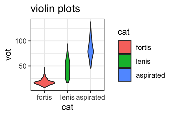
dat.kor %>%
ggplot(., aes(x = cat, y = vot, fill = cat))+
geom_violin()+ggtitle("violin plots")
dat.kor %>%
ggplot(., aes(x = vot, fill = cat))+
geom_histogram(position="identity", alpha=.7)+ggtitle("histograms")
dat.kor %>%
ggplot(., aes(x = vot, fill = cat))+
geom_density(alpha=.5)+ggtitle("density plots")
dat.kor %>%
ggplot(., aes(cat, vot, fill=cat))+
stat_summary(fun="mean", geom="bar")+
stat_summary(fun.min=function(x){mean(x)-sd(x)}, fun.max=function(x){mean(x)+sd(x)}, geom="errorbar", width=0.1)+ggtitle("bar plots+1SD error")
dat.kor %>%
ggplot(., aes(cat, vot, fill=cat))+
stat_summary(fun="mean", geom="point")+
stat_summary(fun.min=function(x){mean(x)-sd(x)}, fun.max=function(x){mean(x)+sd(x)}, geom="errorbar", width=0.1)+ggtitle("points+errorbars (1SD)")
dat.kor %>%
ggplot(., aes(x = yob, y = vot))+
geom_point()
dat.kor %>%
ggplot(., aes(x = yob, y = vot, color = cat))+
geom_point()